
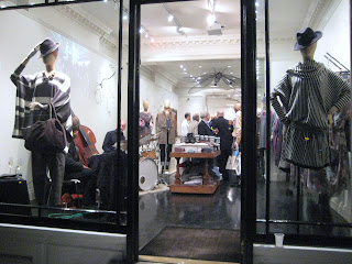
Image Courtesy and Copyright Craig Hewitt

Image Courtesy and Copyright Craig Hewitt
With such apparent pressures to look good (and however we interpret what looking good actually means) that we must look thinner (the only thing my bum looks big in is underwear fashioned from dental floss – not that I’ve ever tried and please don’t try to visualise that), that we must look younger (or lie about it) is growing more and more within male communities. However, as we grow older perhaps the focus on looking 20 years old again clearly becomes an untouchable and obviously unobtainable concept? Well one would have thought so. Have you ever scanned the personal adverts at the back of newspapers or magazines and wondered who actually replied to any of them? Who were the people behind them writing this stuff and what kind of lives they lead? If anything we all have a view about it or at least maybe have wondered about it?
With the massive rise of internet dating and internet chat – with webcam too no less - we come ever closer to the ‘real thing’ that (possibly we think) we may be looking for. From a male perspective this is possibly less about browsing and scanning with a cursory glance and more about semi-feverish hunting – as males tend to do. What we often find of course is that the thrill of the hunt was far more exciting than the end result, leaving us to wonder why we ever spent so much time chasing ‘it’ in the first place (sound familiar?). What is particularly fascinating however is how the internet allows us to be whatever we want to be, whenever we want it, how we want it and so on. We can become the fantasy guy, the glossy magazine cover guy, the guy who can crack walnuts between his thighs, the guy with cruel eyes, the blonde stallion and all the other dreadful stereotypes. We can be the lawyer, the accountant, the Doctor, the astronaut, and whoever else we want to be, in cyber dating. This type of digital social interaction which is clearly not actually particularly sociable can perhaps be a sanctuary and haven for the deliberately creative, deftly crafted and often also demanding personal profile descriptions. That tiny blurred and grainy image of some 20 – 30 year old called ‘HornyandHot’ is perhaps more likely to be pasty and saggy skinned 70 year old Gerald, dog food tester rather than Pascal the sun kissed Parisian supermodel aged 25. Of course, that’s a massive generalisation which I have completely fabricated, there’s nothing wrong with 70 year old people who test dog food but don’t breathe near me please Gerald – oh you get the gist. However, it is perhaps fair to say that generally, we would prefer old age to creep up on us, rather than all over us (however old we are).
The designer, Craig Hewitt, explores these concepts and notions of misleading descriptions through his digital art works - portraits which unravel some of the extremes that people go to, to be perceived other than they actually are. Their agenda perhaps as Hewitt describes is “to be chosen, I’m Mr. Right”. Hewitt analyses the language of profiles and what each of us considers beautiful or otherwise. Hewitt’s subjects with their shiny, metallic surfaces begin their life as photographs taken by him or gleaned from personal profiles (with the owner’s permission of course) which then go through a process he has developed using filters and layering, adding and subtracting various visual elements until the final piece is created. What particularly interests Hewitt is what and who is actually behind these visuals. “It is, after all what is not said in personal profiles as much as what is that fascinates me”.
As a commercial application I find the concept particularly exciting. Whether the visuals are created within a three dimensional format within which product can be placed or whether the visuals themselves can be adapted to cover large areas of spaces and places and form focal points within spaces, I don’t know. As ever the only limitation here is our own imagination. Now, where's that dental floss, I need to fashion a little something for myself.

Image Courtesy and Copyright Craig Hewitt

Image Courtesy and Copyright Craig Hewitt

.JPG)

.JPG)
.JPG)


.JPG)
.JPG)

.JPG)
.JPG)

.JPG)
.JPG)


.JPG)
.JPG)


.JPG)
.JPG)

.JPG)


.JPG)
