Showing posts with label Hugo Boss. Show all posts

Thursday, 14 July 2022

Hugo Boss, London

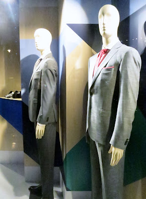
We don't often include this brand here as their schemes tend to be quite abstract or at least have no recognisable narrative.  As with most retailers out there at the moment, during this Sale period, they've chosen to keep their scheme but add the Sale Graphics to the physical windows although to be honest with you we're not entirely sure what the original scheme was about anyway.


Check out our fantastic sponsors below for incredible Visual Merchandising solutions or click on the banners on the side of the main page at www.retailstorewindows.com


 Don't forget you can also join our community and upload your own schemes via our facebook page https://www.facebook.com/groups/154954607862364/ or on our Instagram page https://www.instagram.com/jonathanbaker1/


Sunday, 29 August 2021

Hugo Boss, London

Its been a while since we looked at or included this brand although while they produce great quality schemes they are not always the most exciting to look at.  We were drawn to this one though as while it is quite simple they've actually produced a really interesting installation.  Ok, well there is a large format graphic included which we always dread although given the volume of stores they have we can understand why.  The addition of a very convincing rock formation does add considerably to the scheme with a slightly juxtaposed graphic flooring.


Check out our fantastic sponsors below for incredible Visual Merchandising solutions or click on the banners on the side of the main page at www.retailstorewindows.com


 Don't forget you can also join our community and upload your own schemes via our facebook page https://www.facebook.com/groups/154954607862364/ or on our Instagram page https://www.instagram.com/jonathanbaker1/


Wednesday, 29 May 2019

Hugo Boss, London


Its been a while since we looked at this brand although they have been doing some quite interesting schemes - not easy for a multiple.  Repetition of the brand name has been applied across the whole of the backdrop here in raised lettering although we do seem to remember seeing one of these installations with some of the lettering illuminated however this doesn't seem to have been applied to the store along Bond street.


Check out our fantastic sponsors below for incredible Visual Merchandising solutions or click on the banners on the side of the main page at www.retailstorewindows.com


Don't forget you can also join our community and upload your own schemes via our facebook page https://www.facebook.com/groups/154954607862364/

Thursday, 1 November 2018

Hugo Boss, London


Wow, this is an interesting installation from this brand and one of the best we have seen here for a quite a while.  It cant be easy trying to make this brand look interesting (given the speciality of the product and still maintain the masculine element).  Judging by the sparkling backdrop we're guessing that this is their Christmas installation and so refreshing to not see flashing trees and and of course the dreaded Silver Birches.


Check out our fantastic sponsors below for incredible Visual Merchandising solutions or click on the banners on the side of the main page at www.retailstorewindows.com


Don't forget you can also join our community and upload your own schemes via our facebook page https://www.facebook.com/groups/154954607862364/

Saturday, 10 September 2016

Hugo Boss, London


Gone are the hard silver metal structures and in with a comparatively softer, albeit still very masculine scheme at Hugo Boss.  You have to see this one in the 'flesh' as the lights in the backdrop flash across the windows quite spectacularly.  This is the first scheme we've spotted at this brand where something moved and great to see it progressing beyond its previously very Germanic perspective.


Check out our fantastic sponsors below for incredible Visual Merchandising solutions or click on the banners on the side of the main page at www.retailstorewindows.com


Saturday, 7 May 2016

Hugo Boss, London

http://www.retailstorewndows.com

We've noticed recently that Hugo Boss is looking rather softer than its usual Germanic self and this is a good thing too.  We've also recently read that this brand have unfortunately been closing stores in Asia so perhaps it is repositioning itself ever so slightly in order to appeal to a wider audience?  Who knows?  We can only guess from the outside looking in, however the installations are much more gentle than their usual Grey and hard edged looking schemes with their use of pale wooden screens with flashes of colour.  As always the product is fantastic and we may now be more inclined to have a look inside their stores.

http://www.retailstorewindows.com

Check out our fantastic sponsors below for incredible Visual Merchandising solutions or click on the banners on the side of the main page at www.retailstorewindows.com

http://www.millingtonassociates.com

Friday, 15 August 2014

Hugo Boss, London


Winter it seems is just around the corner at Hugo Boss and their super cool steel installation.  It still slightly amazes us how quickly the Summer season appears to disappear and fade away here in London and in no time at all, once we have 'Back to School' out of the way its almost straight into Christmas.  Anyway, slick vertical and angled lines with layered dressing at Boss right now and one of the best schemes we've seen from this brand in ages.


Check out our fantastic sponsors below for incredible Visual Merchandising solutions or click on the banners on the side of the main page at www.retailstorewindows.com


Saturday, 24 May 2014

Hugo Boss, London


Right opposite Sloane Street tube station is the fantastic Hugo Boss and their enormous window installation of giant foliage and what appears to be a loose sand based flooring.  The whole scheme is punctuated by their abstract mannequins in a pearl Grey finish.


Check out our fantastic sponsors below for incredible Visual Merchandising solutions or click on the banners on the side of the main page at www.retailstorewindows.com


Sunday, 17 November 2013

Hugo Boss, London


We're not entirely sure what we think of this installation.  Just lots of gift wrapped boxes surrounding the usual background.  We've seen this amazing Blue illuminated background for several months now and it did look very enticing initially, although we have moved on now and, well, this scheme hasn't.  Shame really, but quite a lazy scheme from this retailer for this time of year, don't you think?  This of course is not to say we don't like it, as that's irrelevant anyway, but complete lack of humour, complete lack of innovation, complete lack of any excitement or interest at all just screams that they just don't care or that no-one is in control of any form of creativity.  Out-of-the-delivery-box schemes just don't kick it for us. 


Sunday, 21 April 2013

Hugo Boss, London


We weren't initially overwhelmed by this scheme although it has grown on us over the months that it has been in place.  What is particularly interesting about this scheme is the move, whether by default or design we are not sure, to sustainability, albeit perhaps a tiny nod, but a nod nonetheless.  This scheme was previously a swimming pool scenario  all of which has been removed and this gorgeous Blue background kept in place in front of which this nautical theme, which clearly appears to be on trend right now (again) has been installed.  Although our preferences don't lay with anything nautical this scheme does look super slick, don't you think?

Sunday, 3 February 2013

Hugo Boss, London


How gorgeous is this colour Blue here at Hugo Boss?  It reminds us of that incredible Viktor and Rolf catwalk show from a few years ago where videos were projected onto the fashion as the models strutted their stuff.  We're not big fans of this awful nautical trend that appears to be happening around town right now, but at least this scheme is more swimming pool than seafaring malarkey.


Wednesday, 19 October 2011

Hugo Boss, London


We weren't initially sure about this scheme at Hugo Boss right now which we can view around town (and probably every where else around the world)  as it is very similar to an LV scheme from a few years ago which featured Big Brother-style CCTV-style video cameras.  However, while this scheme is essentially metallic paper aeroplanes, there are more layers here than one would expect.  We found ourselves across their Regent st branch today viewing this scheme and bizarrely this whole installation has so many other layers than one would expect.  Shadows of people passing this installation are reflected within these metallic finished pieces which as they (the passersby) walk by are reflected within in them.  This instantly gives these pieces a sense of movement.  Whether by default or by design, suddenly this installation is elevated to the realms of a Fine Art installation where one needs to scratch a lot lower below the surface in order to find some kind of meaning.  This scheme/installation is working way beyond our own expectations and good on these guys at Hugo Boss.

Sunday, 4 September 2011

Hugo Boss and Evelyn Brandt, Berlin


We mentioned about a week ago this scheme at Hugo Boss in London and that we are rather weary of seeing clocks used in window schemes displaying various time zones.  Here in Berlin we have the German version (as well as the stock Hugo Boss version that's gone global but not shown here).  It is interesting to see the localised version of this scheme, although it doesn't make it that more interesting.  Not 100m away from this scheme along the Friedrichstrasse is the Evelyn Brandt version.  OK, well Hugo Boss clearly have the massive budgets and this is probably a local brand, but what a copy hey?  Can you now understand why we are so tired of seeing the repetition of clocks in window schemes?  Everyone else is doing it too.

Thursday, 25 August 2011

Hugo Boss, London


Contrary to our predictions that Hugo Boss would produce 'all things underwater' schemes for the next few months, they have swiftly changed direction and, well...erm...here we have lots of clocks really, albeit representing the various time zones.  Soooooo, we could wax lyrical about the levels of hidden meaning behind these and how they represent the internationalism of the commercial market, and so on.  Or we could say that they we simply repetition of radiating forms of the same size, if we were to apply some product dynamics.  But anyway, we're so incredibly bored with seeing clocks representing various time zones.....because we-haven't-seen-that-before-have-we?  At least the dressing is decent, the product is great, we saw one of the team working on this scheme last week clearly checking out the detail.  BUT, this is as dull as London weather in Winter-time.  Cu'mon guys inject some fun into these schemes.  Menswear can be fun, ironic, interesting etc. without being Neanderthal, dandy and plain old camp.  Do all men really want Black, Brown and Grey all of the time?  No we don't.  You heard it from the source.

Sunday, 17 July 2011

Sunday, 29 May 2011

Hugo Boss, London


Hugo Boss appear to be following an all-things-under-water theme at the moment.  From their recent cut out corals (above) to the current water printed graphic (below) it looks like its going to be a long road ahead exploring all the visuals of the depths of the Oceans.  Starfish,  seaweed, tropical fish, fish close up, fish from a distance, more views of water, images of shells from all sorts of angles, messages in bottles, formations in sand, ship wrecks,  rock pools and just rocks (that they got) ....the list and combinations are virtually endless.  Once retailers hook onto these themes its very difficult to move away from them.  Of course, what we would like to see are the less than idealistic imagery which would make for far more interesting viewing.  Dead towels with mussels growing on them, a carcass of some strange animal that pushed its luck,  plastic forks, dried up rinds of exotic fruits, and anything that fell from a ship miles out to sea, empty beer bottles and rusty drink cans, third degree burns from sleeping in the sun, lost souls, old men with metal detectors, screaming kids, fat bodies squeezed into tiny swimming costumes, hairy guys in tiny bright green speedos, people so tanned they look like old saddles and gift shops that sell junk you never knew you wanted.  Now, that's a list which would make for far more interesting viewing. Don't you think?

Related Posts Plugin for WordPress, Blogger...