Have you had a surreal moment recently? I have. Can you imagine one of your teen icons, well, OK not quite one of my icons but certainly part of my growing up entertainment, standing in front of you just a few metres away? Having spent the evening in a "personal, unrecorded moment" with Lynda Carter, otherwise known as Wonder Woman with her enormous hair, golden lasso and stars and stripes revealing outfit, I feel strangely unhinged. Singing her way through a multitude of cover songs, kind of lounge lizardesque jazzy kind of stuff that these old Hollywood 'stars' of yesteryear seem to do every time they come to London to do their one / two night shows here. I was compelled to go and see this show. Part of me wanted my illusions completely shattered. I was pleasantly surprised that actually the former Miss. America from the early 1970's, Lynda Carter really does have a very good voice and was actually very entertaining - it clearly was my frame of reference that was at fault here. I do still cringe however when I hear the saccharin apple pie stuff although I feel that I was desperately and cynically trying to find the flaws in this whole event. Well, truth be known and to give Lynda Carter credit she actually delivered far more than I expected. I'm not completely won over however, as the whole show promotion was hung around the Wonder Woman stuff, but that's marketing for you. Still, this was the last show, it did what it said on the tin. I am still a little in Surreal mode though.
Sunday, 19 September 2010
Saturday, 18 September 2010
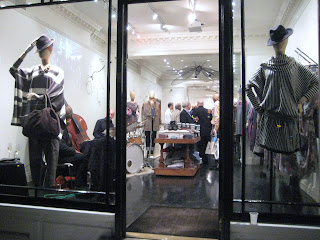
Zara, London
As regular readers will know, I'm not a huge fan of large 'multiple' brands and their out-of-the-manual-schemes, although while this brand do their usual brand stuff, they clearly allow this store here along Oxford st. in the centre of it 'all' to be rather more edgy - thankfully. This scheme contains the product, but is styled in such a way with its multiple layers of complexity, giving it the kind of depth one would always wish to view from this brand. I do love the product anyway and have shopped here many times with them but am even more drawn in to peruse this store in particular just to be part of this experience. With its vintage mannequin head, theatrical mirror, bandaged utensil head dresses, gramophone and furniture, how could one not enjoy it. So much to view in one relatively tiny space, that one cant help but feel drawn in and want to investigate a little further. If all of these stores shared the same philosophy I wouldn't have time to work as the pull of this kind of spectacle is so compelling and potent, at least to me. Anyway, do go and have a look at what these guys have produced, they clearly have their fingers on the fashion pulse and if you want to know whats 'happening' but cant afford McQueen or Vuitton, then check out this store.
Friday, 17 September 2010
Diesel, London
Having really enjoyed the schemes from this brand for quite a long time and particularly this store along Bond St. here in London which always produces something a little different from so many of its other stores. I am, I must admit a little disappointed with this scheme, not because it doesn't work or that I don't like it (because I do), I just feel that I have seen it all before - and I have. As so few people (it seems) follow the windows around the world, or at least either admit it or talk about it, perhaps these brands think that no-one 'out there' will notice that the same / similar scheme has appeared elsewhere and that its OK to repeat the same scheme in another format or another material for an unrelated brand. Is it? Well, I do feel a little cheated when I see this kind of thing happening. If you turned up to a party wearing the same outfit as someone else, would you go home? grin embarrassed? stay and laugh about it? Or be philosophical about it? As you can see from the images below, both Louis Vuitton and Dior (2008) have previously already installed something similar albeit in a different material and I have to wonder who is actually creating these schemes at Diesel and how much knowledge they actually have? Big brother informs me that this brand check out this site and blogs per se are usually about whats happening out there, in here or at least somewhere and have a direct role in marketing and influence (perhaps to a point). I would have produced something quite different for you based on an informed process, however, you never asked me.

Wednesday, 15 September 2010
House of Fraser, London
I was strangely drawn to this scheme at House of Fraser while perusing and flaneuring Oxford street here in London the other evening. Barbara Hulanicki must be 'kerchinging' this month from her haven in Miami whilst this brand promote London Fashion week from this one tiny window - and incidentally on the side of buses etc. Clearly this is a sign of bigger things to come but I just cant drag myself to google to find out what is going on out of sheer lethargy of the google lifestyle and Bing world that I find myself in. However, I do love the Black finish on these mannequins with their, just almost, Clockwork Orange eyelashes. It does look wonderful and the team here have done a fantastic job which I have great joy in sharing with you, however, I must admit that these 20th Century references to nostalgia bore me to tears. How often to we need to rake this stuff up, hey? If its not the 40's, its the 50's. If its not the 50's its the 60's. I know we live on an island but do we need to have the dull Cool, Rule (and all the other adjectives) Britannia mentality for much longer from which we seem to need to define ourselves? Can we just be British, creative and move forward (and supported in that please Prime Minister) and ultimately simply be confident and enjoy the country and world rather than be told by some populist dross glossy 'trend' glam rags that we should keep digging around in the past which clearly is where this stuff comes from?
Selfridges, London
I think Selfridges here in London has a new shoe department? OK well, judging from their latest scheme they clearly have. You have to admire the humour of this scheme from the ever creative team here. It is subtle in places and unashamedly and wonderfully brash in others. Based on popular nursery rhymes the scheme takes us on a journey of just about every combination and perspective to communicate this (they have a lot of windows). Movable parts, giant shoes, the old lady who lived in a shoe, Dorothy (or rather a friend of) in glittery bow tied flats screams from another window. If you pop along the side of the store there is an even greater treat of concept shoes that would make Lady Gaga salivate - maybe she already has these who knows. Anyway, in the tradition of department stores, from an historical perspective, one could stay all day here to enjoy the spectacle, so why don't you.
Tuesday, 14 September 2010
Louis Vuitton, London
We have all marvelled at the latest (and second) installation at the new Louis Vuitton store along Bond st. here in London, although have you been inside yet? An installation of vintage LV luggage, moving fixtures, digital staircases, hand painted luggage in a glass trunk, so limited in its production that you may possibly be the only person in the world to own one. While way, way out of my affordability - although that doesn't matter as this is what makes these things so special - it does create an incredibly exciting experience. On the first floor is the exhibition space with handmade Adel Rootstein mannequins, painstakingly produced and suspended in front of old style theatrical mirrors which reflect the spectacle around this site. The details, details, details. This site truly is extraordinary. A variety of figures and fixtures give each area its own personality and each delivering the perfect rhythm around the space which in turn are supported with Art installations that would rival the greatest international collections. Can you imagine the high street multiples producing something like this? Certainly not. We would never leave. I don't want to wish time away, however I cant wait for my next luxurious fix from this brand and to share it with you. Judging by the queue outside of this store recently, I guess others cant either. If you haven't been here yet, I can guarantee that you too will be mesmerised.
Monday, 13 September 2010
Craig Hewitt, Graphic and Digital Designer
Image Courtesy and Copyright Craig HewittWith such apparent pressures to look good (and however we interpret what looking good actually means) that we must look thinner (the only thing my bum looks big in is underwear fashioned from dental floss – not that I’ve ever tried and please don’t try to visualise that), that we must look younger (or lie about it) is growing more and more within male communities. However, as we grow older perhaps the focus on looking 20 years old again clearly becomes an untouchable and obviously unobtainable concept? Well one would have thought so. Have you ever scanned the personal adverts at the back of newspapers or magazines and wondered who actually replied to any of them? Who were the people behind them writing this stuff and what kind of lives they lead? If anything we all have a view about it or at least maybe have wondered about it?
With the massive rise of internet dating and internet chat – with webcam too no less - we come ever closer to the ‘real thing’ that (possibly we think) we may be looking for. From a male perspective this is possibly less about browsing and scanning with a cursory glance and more about semi-feverish hunting – as males tend to do. What we often find of course is that the thrill of the hunt was far more exciting than the end result, leaving us to wonder why we ever spent so much time chasing ‘it’ in the first place (sound familiar?). What is particularly fascinating however is how the internet allows us to be whatever we want to be, whenever we want it, how we want it and so on. We can become the fantasy guy, the glossy magazine cover guy, the guy who can crack walnuts between his thighs, the guy with cruel eyes, the blonde stallion and all the other dreadful stereotypes. We can be the lawyer, the accountant, the Doctor, the astronaut, and whoever else we want to be, in cyber dating. This type of digital social interaction which is clearly not actually particularly sociable can perhaps be a sanctuary and haven for the deliberately creative, deftly crafted and often also demanding personal profile descriptions. That tiny blurred and grainy image of some 20 – 30 year old called ‘HornyandHot’ is perhaps more likely to be pasty and saggy skinned 70 year old Gerald, dog food tester rather than Pascal the sun kissed Parisian supermodel aged 25. Of course, that’s a massive generalisation which I have completely fabricated, there’s nothing wrong with 70 year old people who test dog food but don’t breathe near me please Gerald – oh you get the gist. However, it is perhaps fair to say that generally, we would prefer old age to creep up on us, rather than all over us (however old we are).
The designer, Craig Hewitt, explores these concepts and notions of misleading descriptions through his digital art works - portraits which unravel some of the extremes that people go to, to be perceived other than they actually are. Their agenda perhaps as Hewitt describes is “to be chosen, I’m Mr. Right”. Hewitt analyses the language of profiles and what each of us considers beautiful or otherwise. Hewitt’s subjects with their shiny, metallic surfaces begin their life as photographs taken by him or gleaned from personal profiles (with the owner’s permission of course) which then go through a process he has developed using filters and layering, adding and subtracting various visual elements until the final piece is created. What particularly interests Hewitt is what and who is actually behind these visuals. “It is, after all what is not said in personal profiles as much as what is that fascinates me”.
As a commercial application I find the concept particularly exciting. Whether the visuals are created within a three dimensional format within which product can be placed or whether the visuals themselves can be adapted to cover large areas of spaces and places and form focal points within spaces, I don’t know. As ever the only limitation here is our own imagination. Now, where's that dental floss, I need to fashion a little something for myself.
With the massive rise of internet dating and internet chat – with webcam too no less - we come ever closer to the ‘real thing’ that (possibly we think) we may be looking for. From a male perspective this is possibly less about browsing and scanning with a cursory glance and more about semi-feverish hunting – as males tend to do. What we often find of course is that the thrill of the hunt was far more exciting than the end result, leaving us to wonder why we ever spent so much time chasing ‘it’ in the first place (sound familiar?). What is particularly fascinating however is how the internet allows us to be whatever we want to be, whenever we want it, how we want it and so on. We can become the fantasy guy, the glossy magazine cover guy, the guy who can crack walnuts between his thighs, the guy with cruel eyes, the blonde stallion and all the other dreadful stereotypes. We can be the lawyer, the accountant, the Doctor, the astronaut, and whoever else we want to be, in cyber dating. This type of digital social interaction which is clearly not actually particularly sociable can perhaps be a sanctuary and haven for the deliberately creative, deftly crafted and often also demanding personal profile descriptions. That tiny blurred and grainy image of some 20 – 30 year old called ‘HornyandHot’ is perhaps more likely to be pasty and saggy skinned 70 year old Gerald, dog food tester rather than Pascal the sun kissed Parisian supermodel aged 25. Of course, that’s a massive generalisation which I have completely fabricated, there’s nothing wrong with 70 year old people who test dog food but don’t breathe near me please Gerald – oh you get the gist. However, it is perhaps fair to say that generally, we would prefer old age to creep up on us, rather than all over us (however old we are).
The designer, Craig Hewitt, explores these concepts and notions of misleading descriptions through his digital art works - portraits which unravel some of the extremes that people go to, to be perceived other than they actually are. Their agenda perhaps as Hewitt describes is “to be chosen, I’m Mr. Right”. Hewitt analyses the language of profiles and what each of us considers beautiful or otherwise. Hewitt’s subjects with their shiny, metallic surfaces begin their life as photographs taken by him or gleaned from personal profiles (with the owner’s permission of course) which then go through a process he has developed using filters and layering, adding and subtracting various visual elements until the final piece is created. What particularly interests Hewitt is what and who is actually behind these visuals. “It is, after all what is not said in personal profiles as much as what is that fascinates me”.
As a commercial application I find the concept particularly exciting. Whether the visuals are created within a three dimensional format within which product can be placed or whether the visuals themselves can be adapted to cover large areas of spaces and places and form focal points within spaces, I don’t know. As ever the only limitation here is our own imagination. Now, where's that dental floss, I need to fashion a little something for myself.
Sunday, 12 September 2010
The Sting, London
The Sting here at Piccadilly Circus have been producing some interesting stuff recently. Their merchandise is a just a little like everyone else's on the high street, although their presentation is actually very vibrant, fun and very appealing to their target market. With such enormous window spaces to fill, there's no wonder large format graphics are being used. It would seem quite enviable to have this many windows to 'play' with although with the high volume turnover that this store must have, these would prove incredibly difficult and impractical to maintain. Still, there are some interesting bits within their scheme which are fun, such as the mannequins in the Grey high gloss finish with realistic faces. Each of the windows also have a variety of themes based around the various brands carried in the store.
Saturday, 11 September 2010
Friday, 10 September 2010
Fortnum and Mason, London
If you want to view quality of product presentation you can do no worse than look toward Fortnum and Mason here in London. With painstaking and meticulous detail these guys strive for excellence, achieving nothing less. Their current fantasy woodland scheme with church ruins, brick walls and trees carrying their exquisite product, out sized toadstools and mossy bases is their latest offering to the high street. I know how hard these guys work and I always look forward to capturing their schemes. This is a traditional style of presentation which requires absolute dedication - text book stuff really. Also, the skills and knowledge that these guys have are sadly dying with so many 'multiple' retailers on the high street producing out-of-the-manual-stuff, so if you want or need to know how to do this kind of work correctly with the same conviction and authority that these guys have then keep following them, and you cant go wrong.
Unfortunately, my images don't do this scheme justice, so if you can, swing by the store and have a look for yourself.
Thursday, 9 September 2010
Fashion's Night out, London, 2010
After a whirlwind of an evening of stores to visit, images to capture and record, eavesdropping on all of the 'working-the-floor' excuses why someone from somewhere should be allowed into the store right now, polished Porche's, glittery Bentley's, security guards ten to the dozen, high heeled wannabees, hasbeens, neverwerebeens, oh you name it, they were all here tonight. Camera phones, pocket cameras, paparazzi, telescopic lenses, were in abundance. Cocktails, mocktails, juices and Champagne flowed all evening. I limited myself to the centre of town tonight even though my invitations stretched across the whole of the city although how many places can one realistically do? And so I limited myself to the places that I was interested in seeing for myself. Anyway, it was incredibly buzzing along Bond St. here in the centre of London for this amazing event. I wandered and weaved through the crowds and here are just a selection of some of the images. This was an incredibly exciting event and if you weren't there or couldn't get there, well maybe next time, for now enjoy the images.
Bluey Robinson playing at Nicole Farhi, London
Gary Wright and Sheila Teague at Teague and Wright - the nicest and friendliest people you could ever meet.
Wednesday, 8 September 2010
Lladro, London
I've always felt that this kind of merchandise is quite difficult to present well. Its small and detailed and ordinarily would have been placed within much smaller illuminated showcase environments in order to focus the viewers eye toward the piece in question, possibly with a glossy enlarged image behind it - although everyone does it so I would almost certainly avoid this. As Lladro along Piccadilly have quite an open space this does make their job very difficult, however there are a whole range of solutions which before now they have never seemed to have adopted. I was quite compelled to show this one to you as I do think this is actually a great solution to their perpetual presentation problem as it is clear they are not going to reduce the size of their fenestration to accommodate their merchandise - it would have been advisable to have done this in the first instance as the merchandise is simply lost in the volume of space they have. Here in the store Lladro have placed the merchandise on these - probably laser cut - cardboard 'environments' in bright Yellow. What this does of course is immediately draw us in to these tiny 'spaces'. Some of the cut outs have been flipped up although I cant quite work out what they actually are? This could have been a great opportunity to have created a kind of narrative using alternating flipped bits to either spell something, tell a story, information about the product, reveal a brand name.....the list goes on. Obviously this is quite an inexpensive scheme, but there were opportunities to have taken this a lot further than they have. I know a few things that I would have spelt out here for a bit of fun, including 'Lladro', of course.
Tuesday, 7 September 2010
Roberto Foddai, Photographer
Image Courtesy and Copyright Roberto FoddaiContemporary commercial spaces and places with ever (sadly) growing prevalence of homogenised multiples’ retail experiences, using a multitude of large format graphics in every combination one would care to mention seem more and more to be exploding images on to the high street of the latest ‘darling’ of the internet or the celebrity-turned-designer (I always wonder if they actually design anything at all – probably not?). Often so many contain unknown faces of people no-one has never heard of - although one feels one should know them - unless you happen to be fourteen years old (maybe I’m showing my age here). With this mass pollution of the high St., it seems an ever impossible task to suggest alternatives and overcome at least a little, the might of these global chain stores and the way that they present their product to us in and throughout their commercial spaces. If there isn’t a formula and it hasn’t been budgeted to the penny or dime then very few companies seem to want to know that there are in fact a multitude of opportunities yet to be explored. It seems an even greater task too, to wrench the creative process out of the hands of the number crunchers and uncreative marketing. Personally, I don’t actually care that my hair has got its mojo back – or that it lost it - although what little hair I do have left, I grew myself. No suburban Russians former locks are going to be glued to my mane of spun Gold thanks very much. And so it seems that, at least for now, we are destined to live here in large format and bland ‘Graphic land’ for some time yet.
However perhaps we can look beyond the latest glossy gossip rag promoting the latest nobody-who-has-ever-done-anything-significant rut that we find ourselves in and inject perhaps a little more thought and depth into the process?
With a little scratching below the surface and a quick trawl around the internet, a visit to an exhibition or gallery, one can find some real gems ‘in here’ and ‘out there’ and none more so than photographer Roberto Foddai. Foddai, of Sardinian origin has worked in London for well over a decade. I found him through pure serendipity and was immediately drawn to his work. With his series of images, such as Men Wearing Dresses (stick that in Prada’s windows why don’t you?) Despair, Strength, the Hitler series, and portraits of Catherine AD, Foddai explores a range of narratives developed through social story telling. Exploring the complex layers of what it means to be human, he unravels some of its complexities and opens a discussion for us to decide what we think rather than telling us what he thinks we should think. The areas which Foddai explores are initially perhaps seemingly a little confrontational, although this is very much from an intellectual rather than an aggressive perspective. He confronts and challenges, through Men wearing Dresses, for example, the whole essence of masculinity and what we perceive this to be. It is the emotional discomfort that Foddai captures in his images of these very masculine men photographed while wearing female apparel. New concepts for images are also developed through the product itself, most of which are found items or purchased second hand and therefore are already loaded with their own narratives and sense of journey before Foddai reinvents and challenges their original context and purpose while simultaneously capturing the outcome.
If we can persuade commercial monoliths to at least scratch a little beyond the latest reality television programme winner and/or adopt the kind thinking and working that Roberto Foddai does, surely we could all live with the pollution of the high street a little better? I’m not suggesting however that Topshop design dresses for men or that L'Oreal suddenly adopts images of a vulnerable Hitler, this would be a literal translation of Foddai’s work, however, with a little more thought, depth and selection of visuals surely this would make the high St. rather more interesting? In the meantime, c’mon then Hitler lets say it, "because we’re worth it".
Subscribe to:
Posts (Atom)